MarCom Studio

Logo
University Logo
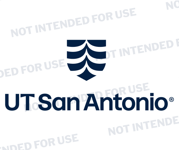
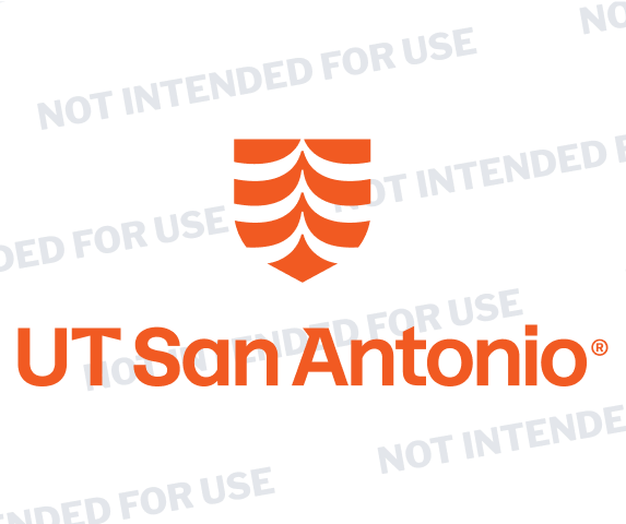
The UT San Antonio logo is the foundation of our visual identity. This section defines its structure, variations and usage rules to ensure it is applied consistently across all touchpoints. When used properly, the logo builds recognition, reflects our brand values and creates a unified presence.
Our logo
The UT San Antonio logo reflects the enduring value of higher education, academic excellence, and the iconic visual heritage of our unified institution. Rooted in our brand promise to be a launchpad for a new era of learning, discovery and care, its design symbolizes upward trajectory, excellence and transformation we offer our students, faculty, researchers and community.
Our logo takes inspiration from the San Antonio River Basin, reflecting the confluence of rivers that shape the region and symbolizing the flow of ideas, innovation and transformation at the heart of our university's mission.
The sans serif wordmark, evolved from current typeface, balances the icon and subtly honors our Texas heritage with a distinctive spur serif.
![]()
Logo versions
The UT San Antonio brand system includes several logo variations, each designed for specific use. These include the horizontal logo, regental logo, stacked vertical logo, circular crest, standalone shield, and sub-brand lockups for schools, colleges, institutes and centers. Each version plays a distinct role in ensuring clarity and consistency across our brand architecture.
Note
As we fully migrate to the new university brand, sub-brand logos for colleges, schools and other areas within the university are being produced in a phased approach. Until a new logo is approved for your area, please continue to use the primary university logo.
Resources
The Brand Team is here to help you save time, avoid costly reprints and make sure your items proudly represent UT San Antonio. We can consult with you on logo usage, provide design support and make vendor recommendations.
- UT San Antonio Brand Team Contacts:
- Users with a @utsa.edu email address: mktg-group@utsa.edu
- Users with a @uthscsa.edu email address: UTHealthBranding@uthscsa.edu
Registered Trademark symbol
To protect the integrity of our brand and maintain legal accuracy, the registered trademark symbol (®) must always appear with the official UT San Antonio logo in all applications.
Do not remove, reposition or resize the ® symbol from the logo file.
This requirement applies to all uses, including digital, print, signage, merchandise and promotional materials.
For exceptions such as embroidery or specialty applications where the symbol may not reproduce clearly, please contact the UT San Antonio Brand Team for guidance and approval.
![]()
Clear space
To maintain visual clarity, always keep clear space around the UT San Antonio logo equal to the width of the “U” of the wordmark. This space should remain free of any text, graphics or other elements to protect the logo's legibility and impact.

Minimum size
To ensure legibility and impact, always maintain the logo's minimum size requirements as specified — never scale it below the recommended dimensions.
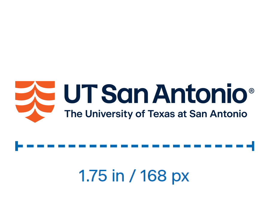
For print applications: 1.75 in
For digital applications: 168 px
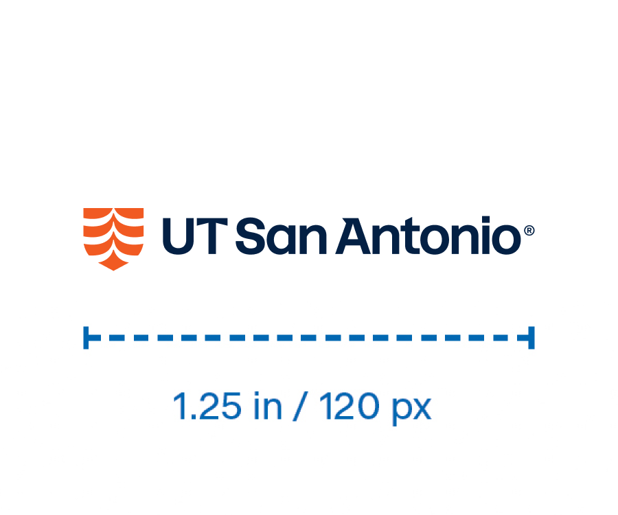
For print applications: 1.25 in
For digital applications: 120 px
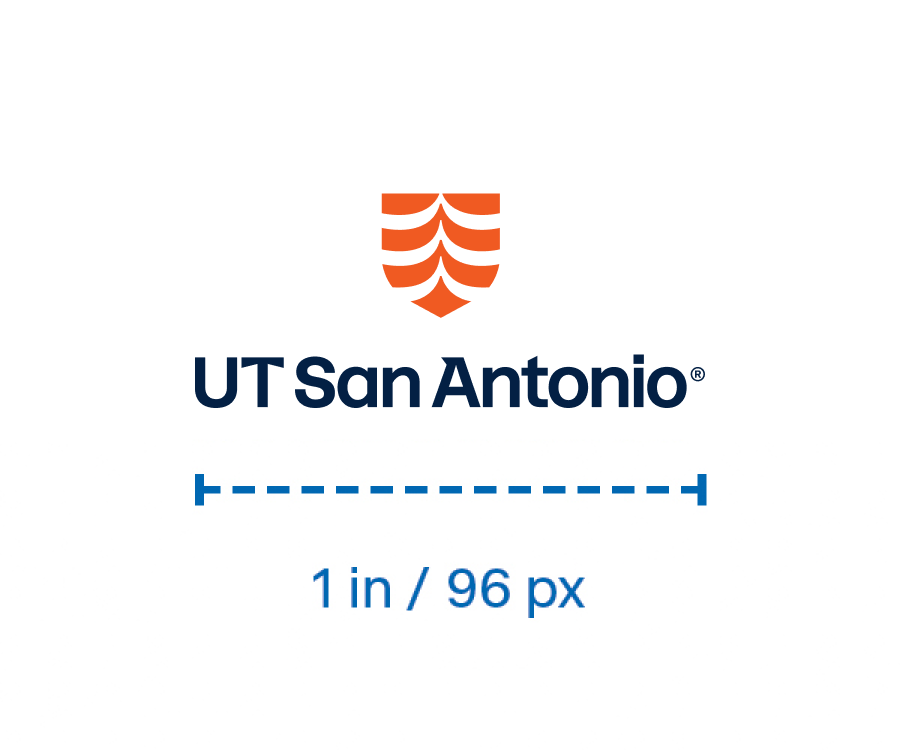
For print applications: 1 in
For digital applications: 96 px
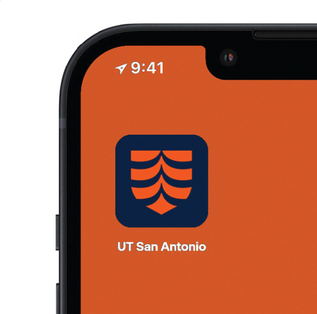
Small-scale applications
Our shield may be used on its own only in small-scale applications where space is limited and legibility is key — such as social media profile images, app icons and favicons. In these contexts, the simplified mark ensures our brand remains recognizable, even at reduced sizes.

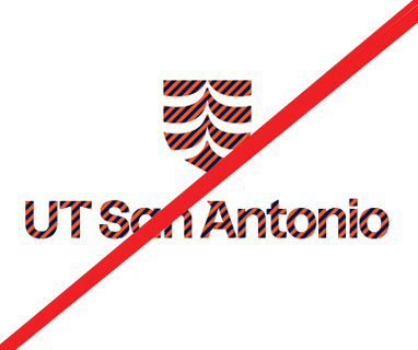
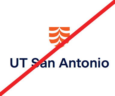
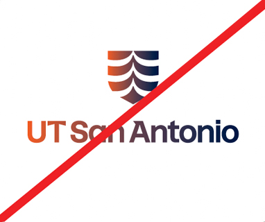
Incorrect usage
When using the UT San Antonio branded elements, the goal is to promote the brand in a positive way. Any representation of the UT San Antonio logo should be executed with care and caution. Please consult with the UT San Antonio Brand Team for approval.


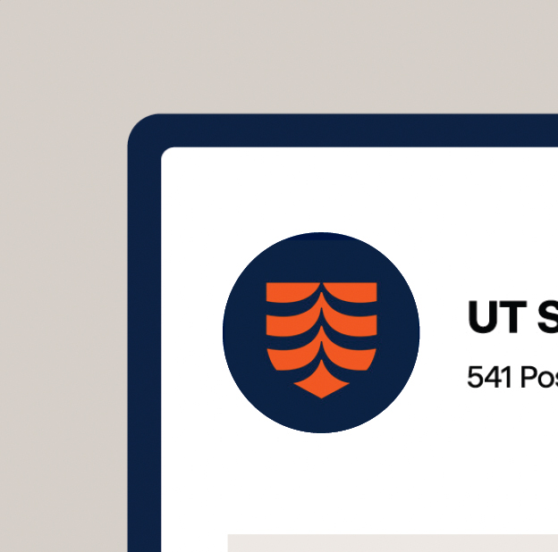
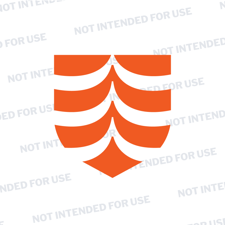
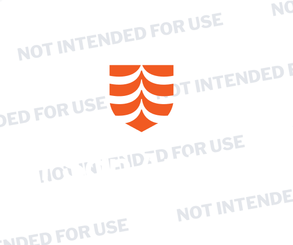
Shield
It is essential to build strong and consistent recognition of the full UT San Antonio logo across all touchpoints. While the shield is a distinctive design element, it should not be used on its own. The full logo is required on all items, products and communication materials.
The shield may be used as a secondary graphic element, only when the full logo is present or in close proximity. It should serve to complement, not replace, the official logo.
To preserve brand consistency and integrity:
- Do not use the shield by itself when the university name is not included in the surrounding written content.
- Do not manipulate, distort or alter the shield, including color changes or special effects.
Embroidery
To ensure legibility and maintain brand integrity in embroidered applications, logos must be sized appropriately and adhere to the following guidelines:
- Logo size: Logos should be embroidered between 2.5 to 4 inches wide and 1 to 2 inches tall, depending on logo orientation and available space.
- White coats and scrub tops: Logos on white coats and scrub tops must be 4 inches wide.
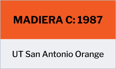
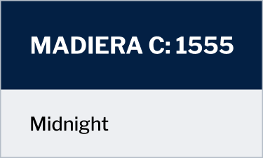
- Use Madeira embroidery thread: Madeira is favored for its durability and ability to withstand repeated washing and wear, making it ideal for healthcare uniforms.
- Trademark symbol (TM): The ™ symbol should be removed from embroidery applications, as it does not reproduce well in thread and may compromise clarity.
- Approval process: A prototype sew-out/stitch-out must be submitted for review and approval before production. Contact the UT San Antonio Brand Team to obtain approval.

Color variations /limited color
Our logo colors are a foundational part of our visual identity. They reinforce brand recognition and ensure consistency across all applications. The following section outlines approved color options for the logo and guidance on when and how to use them.
Use on light backgrounds.
For usage on UT San Antonio Orange, dark secondary colors and dark photography.
Use on dark backgrounds.
Use on light secondary colors and light photography.
Use on white or light backgrounds for single-color imprint applications.

Use for black and white applications only.