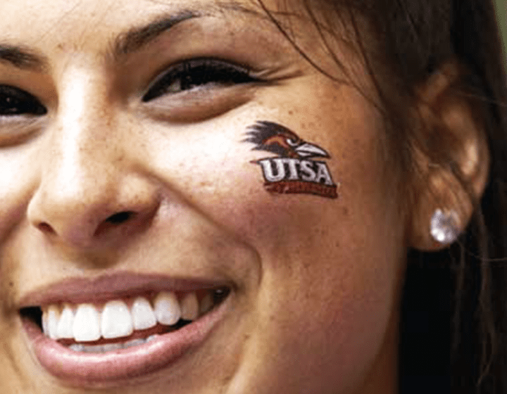
A UTSA Cheer member with the Rowdy logo on her cheek.
Rowdy Redux
UTSA Athletics introduces a new look for a beloved old friend
[ This article was originally published in Sombrilla Magazine in Spring 2008 ]
Twenty years ago a university graphic designer named Tom Palmer was approached by then–Athletics Director Bobby Thompson and Sports Information Director Rick Nixon to come up with a new image and rallying point for the Roadrunners.
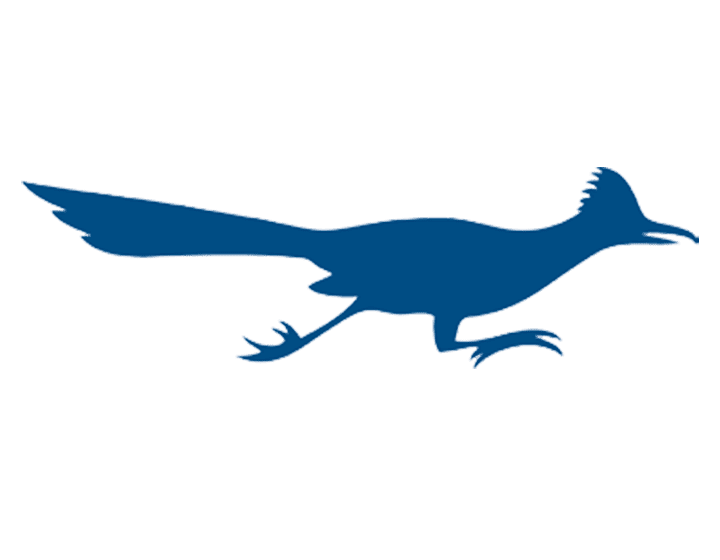
Palmer, who still works at UTSA, recalls Thompson’s attending a basketball game and complaining about the “flat roadrunner.” This epithet referred to the official logo from the late ’80s, which was a silhouette of the familiar bird. Thompson felt that an athletics department trying to build its program needed a stronger and more animated symbol.
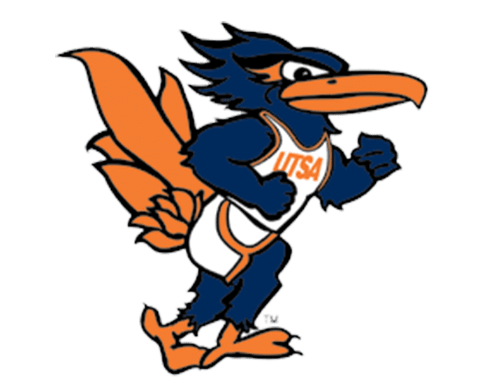
“He [Thompson] wanted a roadrunner that embodied both strength and fierceness, hence Rowdy’s muscular stride. Thompson was also impressed with the University of Georgia logo, which at the time featured a snarling bulldog. That icon’s striking facial expression reflected the appropriate ‘game face,’ and is exactly what the athletics director wanted his mascot to communicate,” Palmer explains. Three months later Palmer had created the Rowdy we all came to know and love.
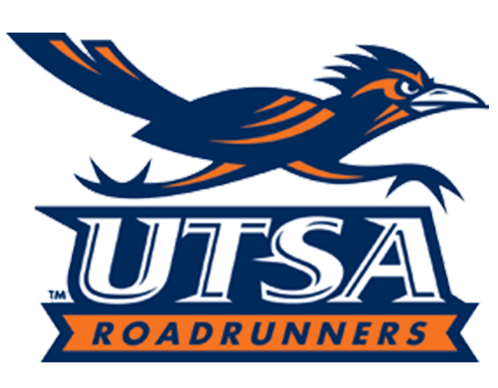
Fast-forward two decades to 2008. The university has a new athletics director—Lynn Hickey—and is looking to build a multimillion-dollar athletics complex and potentially add a football program, all part of an aggressive mission to take the athletics department to the next level. With these new goals comes a new look. The athletics department unveiled a new logo on March 1 during the Roadrunners’ homecoming basketball game against the Texas A&M Corpus Christi Islanders. The logo will appear on uniforms, athletics department letterhead, publications, promotional items, and merchandise.
“Rowdy had aged,” Hickey says. “It was more of a cartoon character, and we wanted to move toward an authentic-looking roadrunner. The new logo is distinctively UTSA, and the new wordmarks allow us to tie our university’s name directly to the Roadrunner mascot for the first time. This will be particularly helpful in designing new uniforms and souvenir merchandise.”
The homecoming unveiling culminated a yearlong process to update the Roadrunner mascot logos and create athletics wordmarks (stylized treatments of the name). The athletics department hired Rickabaugh Graphics from Gahanna, Ohio, to design the new marks. With clients such as Texas A&M, Ohio State, Major League Soccer, the National Football League, and the National Hockey League, Rickabaugh is one of the nation’s top studios for athletic, corporate, and other graphic design work.
Representatives from Rickabaugh came for a campus visit in fall 2006. The company researched the history and traditions at UTSA and conducted personal interviews with administrators and student athletes. They also performed some research on how roadrunners generally look and act, and identified some of their defining characteristics.
The athletics department and Rickabaugh then set up focus groups of alumni, student athletes, and other students, faculty, staff, donors, and athletics sponsors. These groups helped to design the first set of logos and wordmarks by tweaking designs Rickabaugh created for their evaluation.
Eric Rickabaugh, who owns the company and worked on UTSA’s project, designed between six and eight concepts for the focus groups to critique. After the initial feedback his company went back to the drawing board to come up with three final concepts. More than 300 people then participated in the final critique last spring. Creating a tougher look and changing the direction of the roadrunner’s feet were some of the major changes that the final design critique included.
In a final report given to the athletics department, Rickabaugh wrote, “While I agree that collegiate brands that are too aggressive are not advisable, it is critical that the new look reflect a ‘tough’ and ‘proud’ attitude. Since a roadrunner is not the most intimidating of mascots, we need to be careful that it does not come across as weak.”
He adds, “The way the university came together and worked on this project—and included so many different types of constituencies—shows the administration cares about pleasing the university community.”
Rowdy, UTSA’s favorite feathered friend, still is the university mascot. Athletics teams still call themselves Roadrunners or ’Runners, and the colors remain orange, white, and navy blue. What changed was the appearance of the logo. And this time around, there were hundreds of people involved with the process of creating the new look.
“We contracted the best and took our time to develop new logos and wordmarks that are acceptable to the entire campus community,” Hickey says. “The unveiling is the culmination of a year of design work, focus group interviews, and administration approvals. We think that we have new logos and wordmarks that will become familiar trademarks for UTSA Athletics.”